Font Measurements
advance, kern, etc
TLDR;
I learned a bunch about rendering fonts and I thought it would be interesting to read about them from a programmer’s perspective. I gained a ton of empathy for type design and type-setting developers, as they work with a dizzying variety of screen resolutions, font styles, and a wide variety of device speeds to produce type that looks as good as it possibly can under harsh conditions.
Background
I’ve been working on a project involving a two-color e-ink screen. I’m drawing on the screen and that involves drawing text. The project is written in Go. There are common font-rendering librares like Cairo, which are written in C. I find compiling against C libraries like using cgo difficult and complex, so I was really interested in a Go-only solution.
Fortunately, Go supplies a decent image package right out of the box. Combined with the “semi official” font package, it seemed I could do everything I needed.
Unfortunately, I’ve selected some fonts that the most popular font-parsing package can’t handle. So I’m using a different package that can parse many more fonts, but until yesterday didn’t support any of the rendering functions required for drawing on images. In writing and submitting that code, I ended up learning a lot about how fonts are represented in files and what happens when they’re rendered.
I’m going to focus on laying out text left-to-right below. However, there are many languages that use right-to-left horizontal layouts, vertical layouts that go either left-to-right or right-to-left, and languages with alternating line directions. Many of the measurement concepts below apply but may need to be rotated or flipped from a horizontal left-to-right perspective.
Font-y terms
A font is a collection of glyphs - letters, numbers, symbols, ideograms, emojis (😭) that the font is able to draw.
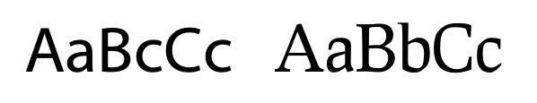
A typeface is a collection of fonts that share a style. This can include italic, bold, or even serif & sans-serif variants.
A serif is that little slab at the bottom or top of a glyph. Here’s an example.
Fonts then, may be serif or sans-serif fonts, though there are other styles like Blackletter. This primarily applies to the Roman alphabet, and Roman-influenced alphabets. Chinese fonts have their own styles that are similar - Songti and Heiti
Font metrics
The measurements described here are common to both manual typesetting and computer typesetting. Manual typesetting is very rare these days, but the terms originate from that practice.
The capital Q and lower-case e below both show their measurements.

The baseline is the line that all text on the line is laid-out relative to. For each rendered glyph there’s an “origin” point on the baseline.
The advance width is the space from a glyphs origin until the origin of the next glyph.
The ascent is the height of a glyph above the basline and the descent is the depth below the baseline. Many fonts also provide ascent and descent measurements that are the maximum of these values for all glyphs. This can help with line spacing.
The bearing of a glyph is the space between the glyph and its origin, or the origin of the next glyph.
Fonts are sized in units called points. There are 72 points per inch.
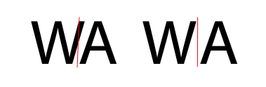
Special topic: Kerning
Kerning is the adjustment of glyph spacing based on glyph pairs. For example, WA is often kerned tighter than the default spacing to reduce the large diagonal line that you’d otherwise have between the two.
Special topic: ligatures
In some fonts, multiple letters may be represented by a single glyph. In some fonts, fl or ff may be joined together so that the characters overlap.

Font file formats
A very common text-rendering system on modern computers is Freetype. Windows is not included in that family. The common windows font-rendering system is ClearType.
Coordinate system
Font sizes themselves are expressed in “points”, and there are 72 of them in an inch. So you should expect a 72 pt font to take up about an inch from line-to-line.
However, computers don’t represent fonts that way. Each glyph in a font is represented by a set of “drawing instructions.” The instructions may specify “draw a line from A to B, then draw a cubic bezier from B to C, then draw another line from D to E.” These drawing instructions are represented on a single coordinate system, which is then scaled by the point size to create the final set of coordinates.
Font file coordinate systems use a special representation called “fixed point.” Because fonts need to represent sub-pixels, we can’t use whole integers. Why not use floating point numbers? At different scales, floating point numbers have different levels of precision. So font files use fixed-point representations for their various numbers. You can think of these as floats with a fixed precision. Several fixed-point formats are used in font files for kerning, glyphs etc. The glyph coordinates are written using “26.6” The integer part has twenty-six bits, and the fractional part has 6 bits, to fill the space of a 32-bit integer. This means that the resolution of the fractional part is 1/64. Here are some binary representations of numbers in fixed point:
| Number | Fixed-point |
|---|---|
| 1 | 1.000000 |
| 1.5 | 1.100000 |
| 2.25 | 10.010000 |
| 5.75 | 101.110000 |
| 1 63/64 | 1.111111 |
So, to render a font on-screen, we need to put all of these pieces together:
- Take the string you need to render and get the coordinates for each glyph.
- Substitute ligatures where necessary, and adjust the spacing based on the kerning between glyphts.
- Create a pixel coordinate system based on the dots-per-inch (DPI) of the screen you’re rendering to. iPhone 11s have a DPI of 463 pixels per inch.
- Scale all the font coordinates (at 72 points per inch) by your screen grid (463 pixels per inch), using fixed-point math.
You may do all the above glyph-by-glyph, though you may have to “go back” to deal with ligatures.
Rasterization
Once you have the set of all font coordinates, you need to actually draw those dots on-screen. Some coordinates will be for fractional pixels, but we have an integer number of pixels. This is where “rasterization” comes in. Rasterization is done for just about anything displayed on a computer screen, from video games to text, to photos. In font rendering it involves shifting items to fill pixels, and adjusting colors so some pixels on the edge of letters are a lighter gray so the pixels appear partially filled.
Here’s an excellent site that explains a rasterizer for TrueType in greater detail.
Type rendering is a topic filled with nuance and artistry - the above only provides a simple summary. Some of the computer industry’s most talented graphics engineers have worked in this field for decades. Computer displays are now the place where westerners spend the majority of their reading time, so clear and attractive type on screens remains incredibly important.